Planning packaging for the festive season rush
From Navratri to Diwali, demand for cartons doubles. When to order, how much to stock and what to agree early.
Same-week delivery across Ahmedabad and Gandhinagar · Short runs from 500 boxes
Plot 412, Phase IV, GIDC Vatva, Ahmedabad 382445
Mon–Sat · 9 am – 7 pm · Sun closed
Ink colours, line thickness, logo size and the small artwork changes that make printing on kraft look clean.
Most of the printed boxes we make use flexographic printing: rubber or polymer plates, water-based ink and brown kraft board. It is economical for runs from 1,000 boxes upwards, but it behaves differently from printing on paper, and a few artwork changes make a big difference.
Think about colour first. Brown kraft absorbs ink and darkens it, so colours look duller than on screen. Black, dark blue, dark green and deep red print well. Light colours, such as yellow, pink and pale blue, barely show on brown board. If your brand uses light colours, ask for white-top liner, which costs about ₹1.50 to ₹3 more a box.
Keep lines thick and text large. Flexo ink spreads slightly as it presses into the board, so fine lines fill in and small text blurs. We ask for lines at least 0.5 mm thick and text no smaller than 8 points, and more on the larger flutes. Avoid photographs and fine gradients; solid shapes print best.
Keep important elements away from creases and flaps, at least 10 mm from any fold line, because the board bends there and the print can crack. Every artwork is checked against the dieline we send, with fold and cut lines marked. Send artwork as vector files with fonts converted to outlines. We send a digital proof and a printed sample before the full run, and plates are kept on file for repeat orders.
Keep reading
From Navratri to Diwali, demand for cartons doubles. When to order, how much to stock and what to agree early.
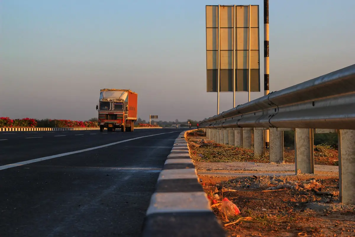
How our own trucks cover Ahmedabad, Sanand, Changodar and beyond, and what to plan for when boxes go further.
What happens after you send us a size: the dieline, the sample box, the order and delivery, in about two weeks.